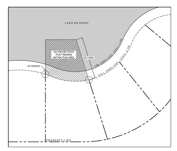
City or town ordinances aim to reflect community needs and aspirations. While an ordinance conjures up images of dense, inaccessible legalese or a document full of technical details—and there may be some truth to that—the best ordinances and planning codes are easy to understand and navigate for someone who may not be an expert. While there are necessary technical and legal details, planners at WithersRavenel put a lot of effort into crafting documents that can be easily understood and used by the public at large.
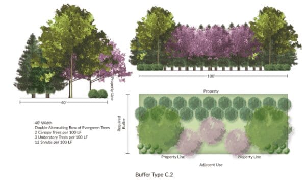
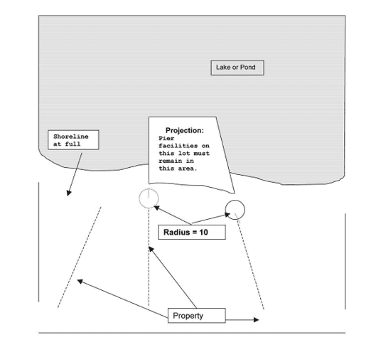
One of the ways our Planning team approaches drafting an ordinance is the inclusion of a graphical representation of the information.
“Ordinances are to be used by the entire community, and for the layperson, the importance of a graphic in an ordinance is to make the technical information understandable. This is also important for the staff that are going to be responsible for enforcing it,” according to Karen Mallo, Senior Planner at WithersRavenel.
Research has shown the effectiveness of visual aids in enhancing human cognition, comprehension, and usability.
“So, it’s not just about providing pictures and diagrams and graphics, but it’s also creating the document itself with an eye for graphic design and user experience that is helpful,” said Jay McLeod, WithersRavenel Director of Community Planning.
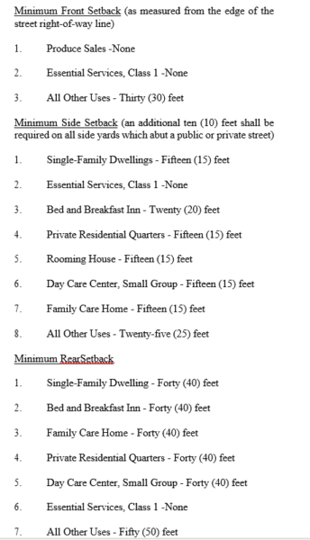
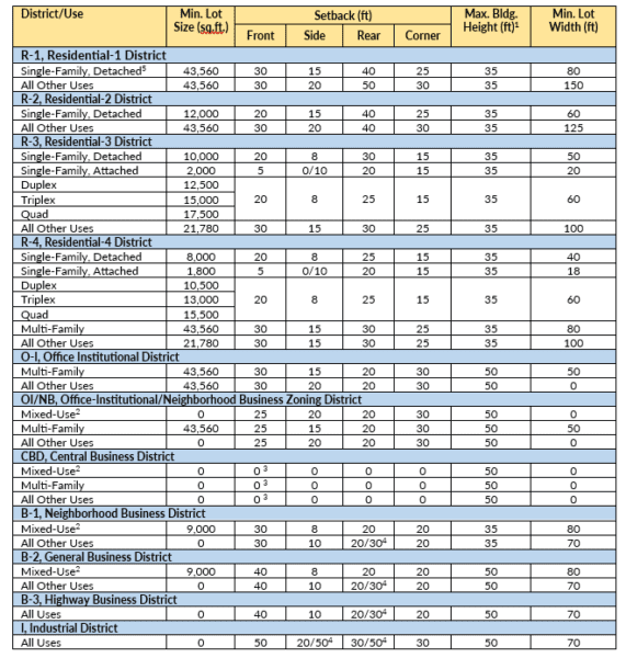
Visually enhanced documentation doesn’t only mean graphics, but fonts and font colors that differentiate various sections of an ordinance. When people really need to access something very quickly, and if there’s no graphic or any kind of differentiation of text, it can become challenging for the user.
Colors, fonts, and creative formatting certainly can assist the reader in calling their attention to a particular requirement. Pages and pages of black text not only become monotonous but provide no direction to the reader. Creative formatting makes it not only easier to read but interesting and more likely to keep the attention of the user. (See before and after examples at the bottom of the story)
Searchability invites familiarity
The online presence and accessibility of community regulations is an important consideration during ordinance development. More and more jurisdictions are opting to host their ordinances online, so anyone can access them, read them, and search for specific regulations in the document.
WithersRavenel’s planners use a variety of formats in the development of a Code or Ordinance based on the client’s request. Usually, this is Microsoft Word and then converted to a .pdf. The planning team also uses hyperlinks and embedded headings to create an interactive search and table of contents for the user that can take them to practically any place in the document they need to go with a click of a button.
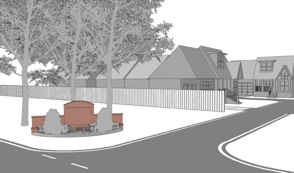
Balancing words and images
Technology affords the ability to host better and richer graphical content in an ordinance document, but it takes a human touch to put it on paper (or a touchpad).
WithersRavenel’s Design + Planning Department provides a unique opportunity to bring these two strands together when writing ordinances and codes
With the advantage of being part of the same larger team, WithersRavenel’s planners, landscape designers, and landscape architects put their heads together to create a document that not only has high-quality visual elements but also comes together precisely in the way envisioned by the planners.
But Jay cautions, that not everything can be visually conveyed in an ordinance. “Some things are more nuanced than what a picture conveys,” he said. “These ordinances are legally binding documents that regulate private property rights. They must be clear, defensible, and in support of local government responsibilities to protect and promote the public health, safety, and welfare.”
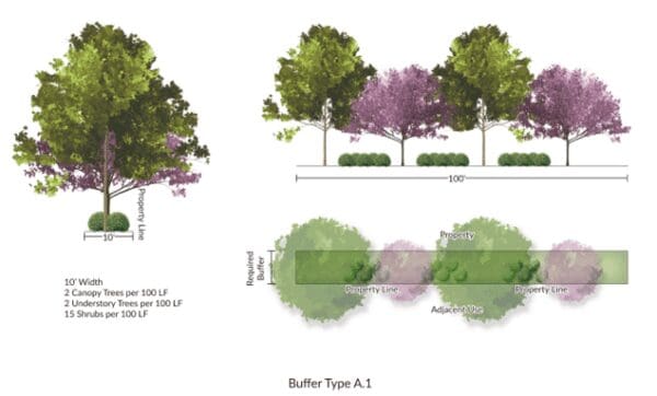
Where graphics have the greatest impact
According to Karen, signs and landscaping are the two areas where graphics within a planning document are making the biggest difference. “But we’re also doing a lot of processes, and we’ve integrated flow charts that clearly show applicants what they need to do to navigate the development review process.”
When writing development regulations, the planners start off by defining the community’s standards and then adding graphics that can clarify or replace text.
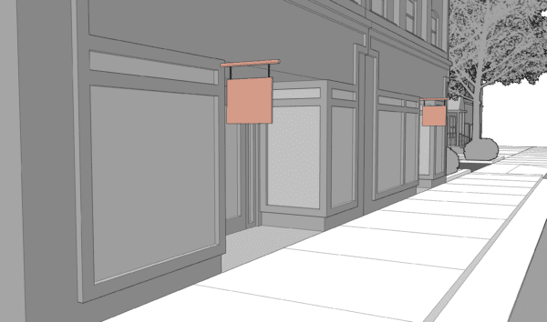
Karen adds: “Sometimes that suggestion is from us. Sometimes that’s at the request of the planning board members who may not understand it and say, ‘hey, can we have a visual for this,’ and we’ll create and insert a graphic into the text.”
For Karen, “It’s nice to have design and planning in the same group here at WithersRavenel because we can easily address the graphical representation our clients want and need and provide them with an exceptional deliverable.”
Want to know more about our approach to planning or have a project in mind? Reach out to WithersRavenel Director of Community Planning Jay Mcleod at jmcleod@withersravenel.com

