The City of Sanford’s journey began with a routine sewer asset management plan update. WithersRavenel’s GIS team completed this update in three phases:
- During Phase I, WithersRavenel worked with the City to develop a set of Key Performance Indicators (KPIs). These KPIs focused on answering the most urgent questions of both the internal utility management staff and external utility stakeholders.
- During Phase II, WithersRavenel determined the risks to the system and developed an action plan to mitigate them. This risk assessment formed the basis of the updated asset management plan and an accompanying sewer capital improvement plan.
- During Phase III, WithersRavenel updated the City’s GIS data and data management schema in ArcGIS.
For most clients, this is where WithersRavenel’s work would end. The City of Sanford, however, wanted to take things a step further. They wanted to understand how different levels of funding for asset improvement projects would affect the overall condition of their sewer system over the next 25 years.
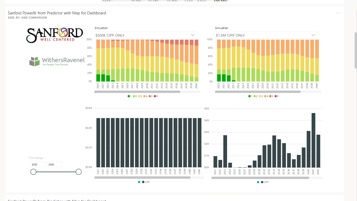
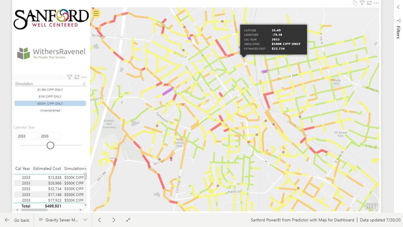
In response, WithersRavenel’s GIS and Funding & Asset Management teams created an interactive sewer model linked to the City’s ArcGIS database. The model was created using lifecycle modeling and is presented in a dashboard with three primary views:
- A color-coded line map, which shows the location and condition of all of Sanford’s City-owned sewer infrastructure
- A service life graph, which shows the distribution of like-new, young, middle-aged, old, and failed infrastructure by year
- A cost graph, which shows the cost to maintain the system each year
Each of these views offers the user a simple drop-down menu to toggle between the current rehabilitation program and hypothetical programs that allocate $500,000; $1,000,000; or $1,500,00 per year to repair projects. It also allows the user to slice the data into multi-year time spans, or drill down into the specifics of a single year. Users can compare the outcomes of different funding approaches, and changes are reflected in real time.

The map view allows users to visualize rehabilitation projects spatially and explore additional “what-if” scenarios. For instance, the user can set the year filter to display the map as it is expected to look in 2025 to determine where the highest concentration of end-of-life assets will be located at that time. After identifying a segment of sewer line in urgent need of repair, the user can quickly and easily click and drag to select the neighborhood and find out the cost to repair all of the surrounding sewer at the same time.

The result is an information-rich but easy-to-understand model of the City’s sewer infrastructure. It not only displays the potential financial consequences of deferred maintenance, but also provides tools for prioritizing projects based on urgency and on proximity to other projects. It also provides supporting documentation should the City choose to pursue grant funding from the state or federal government.
The sewer model has been so successful that the City has already begun working with WithersRavenel on a companion model for water infrastructure.
